

Share Article:
Storytelling with words can persuade donors to give, but there’s an often overlooked tactic that’s just as powerful: nonprofit data visualization. The right chart, graph, or map can highlight your community’s needs and illustrate the impact of the work you’ve done in a way that a simple table or report can’t.
In this guide:
- What data visualization is and why it’s valuable
- An overview of the main types of data visualization
- Tips and best practice for sharing data in an engaging way
- Tools you can use for data visualization—including free and affordable options
What is nonprofit data visualization?
Nonprofit data visualization is the process of sharing information in a visual way. Data is presented as a highly visual chart, map, or infographic, rather than lines in a spreadsheet, database, or report.
Charitable organizations and nonprofits often use data visualizations to share data with stakeholders, including donors, grantmakers, board members, and corporate sponsors. These visually rich charts or dashboards are also used internally to help with decision-making.
Why displaying data visually matters
Data visualizations allow you to take complex data and make it easier to understand. It’s hard for stakeholders to engage with a list of facts and figures. But when data is displayed in a chart, infographic, or map, it’s much easier to picture the need or a nonprofit’s impact—especially when you combine data visualization with storytelling.
Connecting stakeholders with your mission or results isn’t the only benefit. Effective use of data visualization also supports:
- Faster decision-making
- Real-time monitoring
- Identifying trends
- Information sharing
- Higher levels of engagement
- Trust and transparency
Data visualization helps you share information in a more accessible, engaging way—so you can rally support, demonstrate progress or results, and tell data-driven stories about what you do and why.
6 Key types of nonprofit data visualization
There are 80+ different ways to visualize data, but not all of them are relevant for nonprofits. Here are the six main types of data visualization that nonprofits can use for storytelling and engagement.
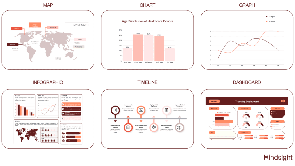
1. Maps
Maps allow you to present data for a variety of locations in a familiar format, so stakeholders can understand issues, challenges, or needs on a local level. Maps might cover neighborhoods, cities, regions, states, countries, or the entire world, depending on where your nonprofit operates.
Data-rich map visualizations work best when they show one type of data, like the amount of deprivation, happiness levels, or the number of beneficiaries in each state.
2. Charts
Charts help you summarize large amounts of information to make it easier to understand, usually through the use of tables or diagrams. Popular types of charts include pie charts, bar charts, and heatmaps.
This type of data visualization helps readers quickly identify outliers, as they’re presented as the biggest slice in the pie or the tallest bar. Charts like this are great for storytelling or motivating stakeholders to take action—like switching to monthly giving or making a lifestyle change based on what your chart shows.
3. Graphs
Graphs are a type of chart, but they focus on displaying numerical data and comparing the relationship between two variables. Where charts usually offer a snapshot view, graphs allow stakeholders to track change and patterns over time.
Nonprofits can use graphs to demonstrate their impact over time, or to raise awareness of a concerning trend that needs action—like an increase in homelessness, reduction in air quality, or a rise in the number of animals in local shelters.
4. Infographics
Infographics are one of the most popular types of data visualization, as they can be used to share a range of information in one easy-to-share image. As the name suggests, infographics are highly visual—with icons and graphics that match and illustrate each statistic or metric.
This type of nonprofit data visualization is ideal for when you want to share a round-up of different insights, like the highlights from your annual survey or the results from your years-long program or capital project.
5. Timelines
Timelines help readers visualize moments, milestones, and highlights over a period of time in a much more engaging way than a simple list or table. Dates are laid out on a line, with added context at specific points that you want to draw attention to.
Use timelines to illustrate how long a capital project will take and what will happen along the way. Timelines are also ideal for reflecting on everything you’ve achieved so far—like a timeline of your nonprofit’s history and all your major milestones.
6. Dashboards
Real-time dashboards enable nonprofit staff members to quickly see lots of data all at once. Dashboards are typically created for specific projects or programs, or to monitor a specific type of data—for example fundraising or financial data.
A major benefit of dashboards is that they’re easy to share with other people. Donors, stakeholders, grantors, and board members can all get a snapshot view of the impact of a program or the need for support.
While 90% of nonprofits collect data, only 5% use that data to make decisions. Be one of the nonprofits that uses data-rich graphs, charts, and dashboards to inform decision-making.
7 Data visualization tips and strategies for nonprofits
The secrets to making an impact with your charts and maps lie in the knowledge of other nonprofit pros who have done it before. Whether it’s your first time creating an infographic or you’re simply looking for fresh ideas, here are some tried-and-tested tips on data visualization for nonprofits.
1. Get clear on your audience
Understand who you’re presenting the data to so you can select the right information and display it in the right way. Sharing financial data with your nonprofit board members requires a very different approach to creating a shareable graphic about your latest capital program.
Knowing your audience allows you to decide:
- Which data to use
- How much detail to go into
- Which type of visualization works best
- Whether you can create it in-house or you need external support
- When and where to share your visualization
2. Choose the right type of visualization
Different styles of nonprofit data visualization work best for different purposes, so it’s crucial to make sure you align your goal and the data you have with the right option.
Here’s a quick guide on when each type of data visualization works best:
- Map: Geographical data.
- Chart: Comparisons and ranking data.
- Graph: Patterns and trends over time.
- Infographic: Large amounts of data and statistics.
- Timeline: Activity and impact over time.
- Dashboard: Real-time statistics.
If you’re not sure which type of visualization to use, try a few and see which one most accurately illustrates the point you’re trying to make.
3. Add context to your data
Infographics and charts help to make data easier to understand, but headings and summaries go even further to add context to your data. Add notes to your visualizations to tell your story.
Examples of useful context to add include:
- How you collected the information
- Any notable events that might have influenced outcomes
- Trends or patterns you’ve noticed
- Figures that feel especially relevant or noteworthy
- Milestones you’re especially proud of
4. Use colors wisely
Color helps readers quickly understand what they’re looking at, but too many colors and patterns can be overwhelming—especially if there’s no consistency between charts or graphics in the same document.
Our go-to advice on using colors includes:
- Choose colors that are distinct from each other
- If you need to use different shades of colors, consider whether you can create separate charts instead (or use a different type of visualization, for example an infographic)
- Avoid a grayscale chart that makes it hard to differentiate between shades
- Use the same color(s) to represent variables across your charts
5. Keep it simple
The goal of data visualization is to make the information as easy to read as possible, so continue that theme by keeping your charts and graphs simple. Strip back every element of your visualization to only what’s necessary.
Simplify all aspects of your data visualization, including:
- Font choices and sizes
- Icons and graphics
- Color choices
- Filtering options (for interactive data visualizations)
- Layout styles
This advice is especially relevant for infographics and charts, where it’s easy to add lots of images, fonts, and icons without realizing it.
6. Make it easy to share
If you want your visually-rich reports or documents to reach a bigger audience, they need to be shareable. Following the tips above helps to make your content more engaging, but there are some extra steps you can take to encourage others to share.
Here are some of the ways you can make your data visualizations easier to share:
- Create standalone graphics from your data-rich reports
- Use teaser images on social media that link to the full infographic (especially if it’s very long)
- Optimize images so the file size is smaller
- Include your nonprofit’s name and logo on your graphics (to add credibility that encourages supporters to share your content with others)
- Use software that allows for native sharing by email or social media
7. Consider accessibility
Nonprofit data visualization offers audiences another way to engage with information, but it’s not always the most accessible format for some people. Aim for your content to be as accessible as possible, and offer alternatives for community members and other stakeholders who want the same access to data insights.
Here’s how you can make your data visualizations more accessible:
- Follow (and apply) guidance on web accessibility from the ADA
- Improve contrast between colors
- Add captions and context notes to visual elements
- Provide data in another format, for example in a table, video update, or written report
Data visualization tools for nonprofits
You don’t always need specialist tools to create data visualizations—especially if you’re creating an infographic. But for more complex data design projects, data visualization software can take care of the heavy lifting when it comes to accurately displaying your information in the right format.
If you’re considering data visualization platforms, here are some that other nonprofits have used:
- Canva: For simple charts, infographics, and shareable graphics that promote more complex visualizations
- Databox: For AI-powered data analytics and presentations for board members
- Flourish: For affordable data visualization tools including maps and interactive content
- Microsoft Power BI: For advanced data analytics and complex visualizations
- Tableau: For enterprise-level business analytics.
When you’re comparing different data analytics and visualization software, look for one that integrates with your fundraising CRM. If you can connect the two you can sync data automatically and turn your nonprofit data into a powerful storytelling tool.
Take advantage of the power of data in storytelling
Data visualization allows you to tell the story of why your nonprofit organization exists, the purpose you serve, and the impact you make. All that project research, outcomes information, and donor data that lives in your fundraising CRM can help you take your mission further—you just need the right way to showcase it.
Nonprofit data visualization FAQ
How do you decide which type of chart to use?
Consider the type of data you have, what format it’s in, and the message you want to communicate. To show trends or reveal patterns, use a line chart. For comparisons, try a bar chart. If you want to explain how different parts of a whole come together, you’ll want a pie chart.
Which data visualization tool is best for nonprofits?
The best data visualization tool depends on what your needs are, how big your budget is, and whether you need more than simple graphs and charts. If you’re happy to manually create charts and infographics, Canva offers a nonprofit discount. Flourish is another affordable option for small nonprofit teams.
What should you avoid in data visualization?
Best practice in data visualization is to avoid too much information being displayed (cluttering), misleading scales or disproportionate sizing, too many colors or patterns, and not enough context in the way of headings or comments.

Be the first to read our resources.
The world is changing quickly—and our resources help you stay on top of it all. Sign up to get new insights, success stories, and more, sent right to your inbox.
Explore related resources.
-
KindCon Partner Spotlight: Driving real impact with Attain Partners

Post KindCon Partner Spotlight: Driving real impact with Attain Partners
Learn how to calculate the most important fundraising metrics, boost retention, and turn data into real donor growth.
-
How to build actionable donor lists for nonprofits

Post How to build actionable donor lists for nonprofits
Donor lists for nonprofits are the secret to smarter fundraising. Learn how to build, segment, and score your donor data to maximize your impact.
-
Nonprofit board governance: Roles, responsibilities, and best practices

Post Nonprofit board governance: Roles, responsibilities, and best practices
Learn the core pillars of nonprofit board governance. Discover essential roles, legal responsibilities, and best practices to maximize your mission's impact.